
For us, getting to redesign a website is a real treat. Most of the time, we are taking an old, slow, and ugly website and completely revamping it. In the case of BrainWiz.org, we weren’t just revamping it, we were bringing it back from the dead.
The owners of Brain Wiz spent a lot of time and energy in creating great content for the site but didn’t put too much effort into the design and functionality. Because of this, a lot of the traffic that was coming to the site was immediately bouncing (leaving without going to another page).
To get that bounce rate down and give Brain Wiz another chance at life, we complete redesigned the site — from the hierarchy to the navigation to the color scheme.
What is Brain Wiz?
Before jumping into an explanation of our redesign, let’s talk about what their website is all about. BrainWiz.org focuses on helping people increase their focus through natural means (e.g. supplements, meditation, exercise). Their main focus is reviewing nootropics. Nootropics are supplements that help to improve your cognitive state.
Old version of Brain Wiz
Why We’re Redesigning
The truth is, the current website design has a lot of holes in it. By this I mean that it was leaking traffic because it was not properly optimized to convert that traffic. In addition, the design of the website was pretty basic. While fine for a blog just starting out, they had clearly outgrown it.
The New Design
We knew there was a lot to handle in designing the new website so we broke it down into four manageable parts: look and feel, conversion optimization, responsiveness, speed, and content. We’ll be going over a few of these below…
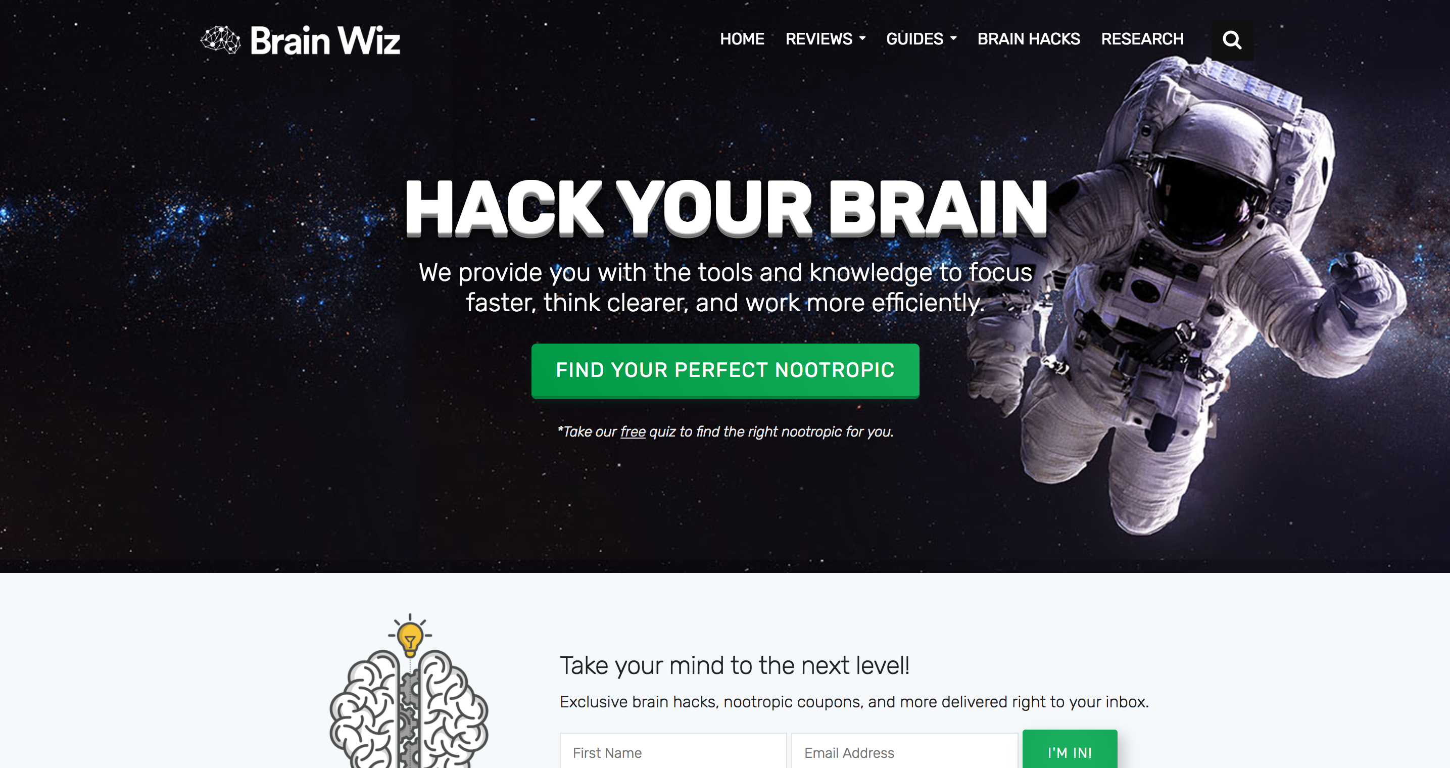
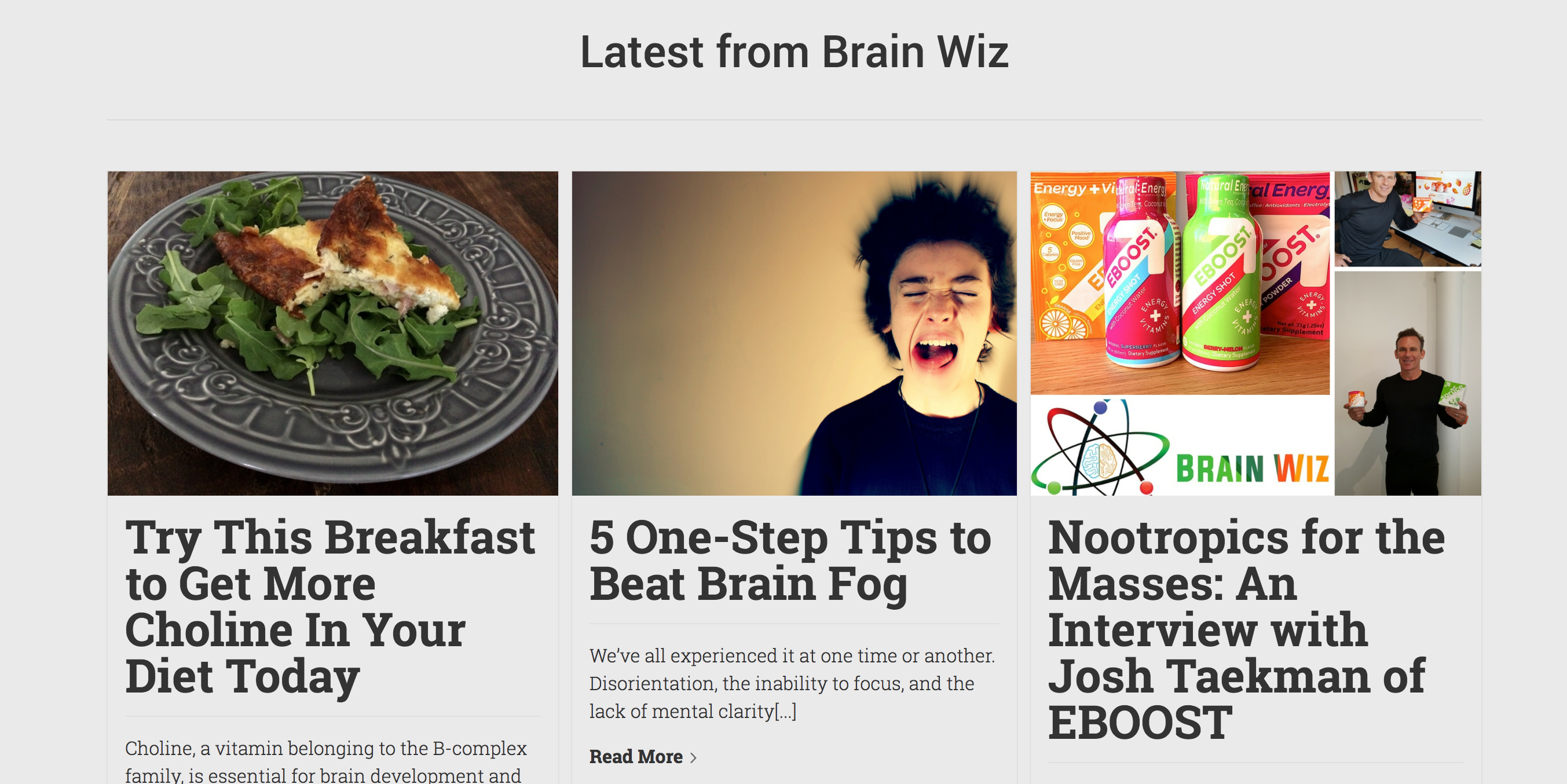
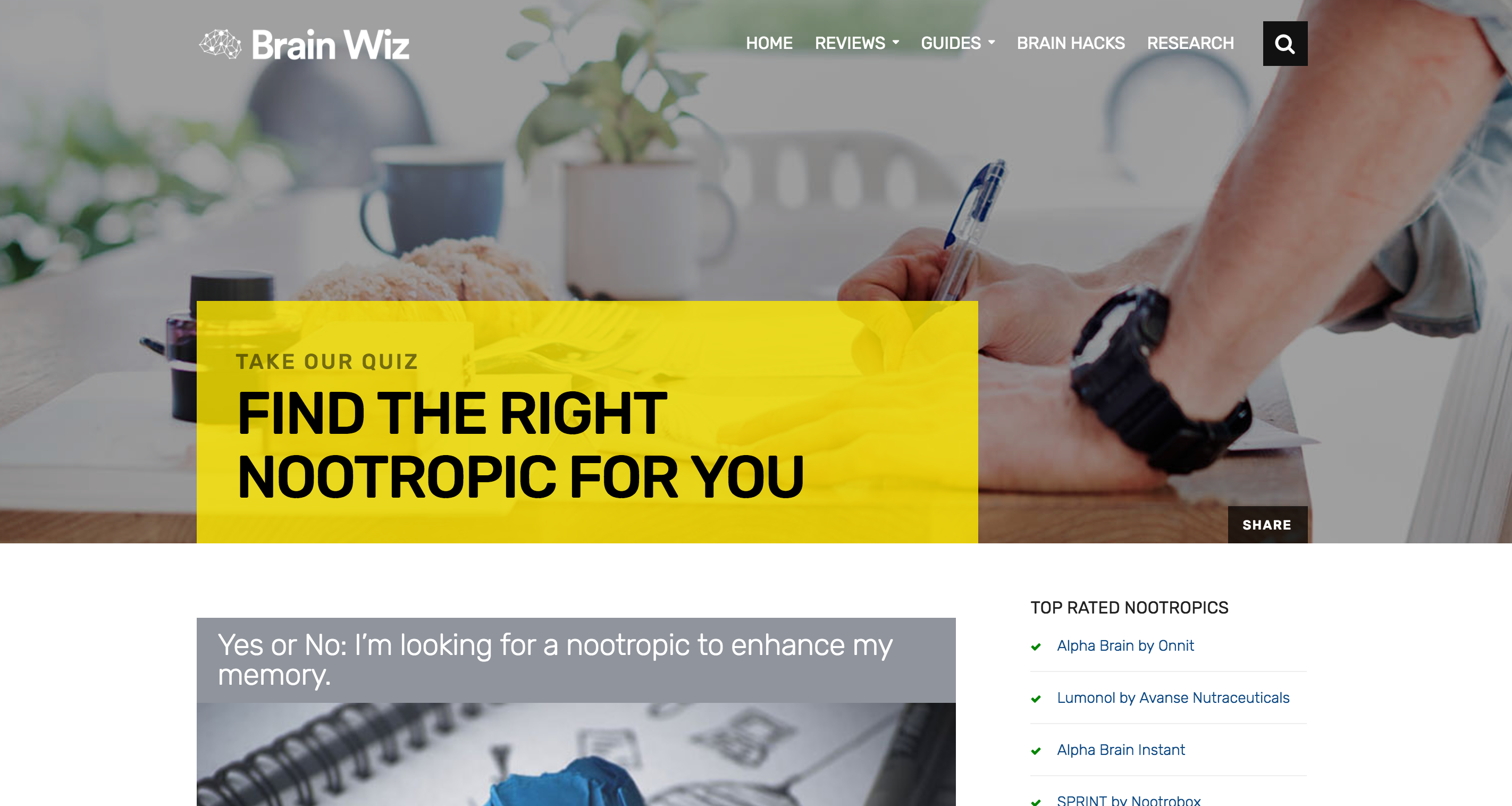
New version of Brain Wiz
Look & Feel
When it comes down to it, all websites are a form of art. We visit a webpage and make an instant judgement based on the color, typography, lines, and many more factors.
The problem with the old website was that it had no soul to it. Visitors would come to the website to get the information they wanted but wouldn’t stick around because there wasn’t any reason for them to. Nothing on the old website made you say, “wow”. We wanted to completely change that.
Font
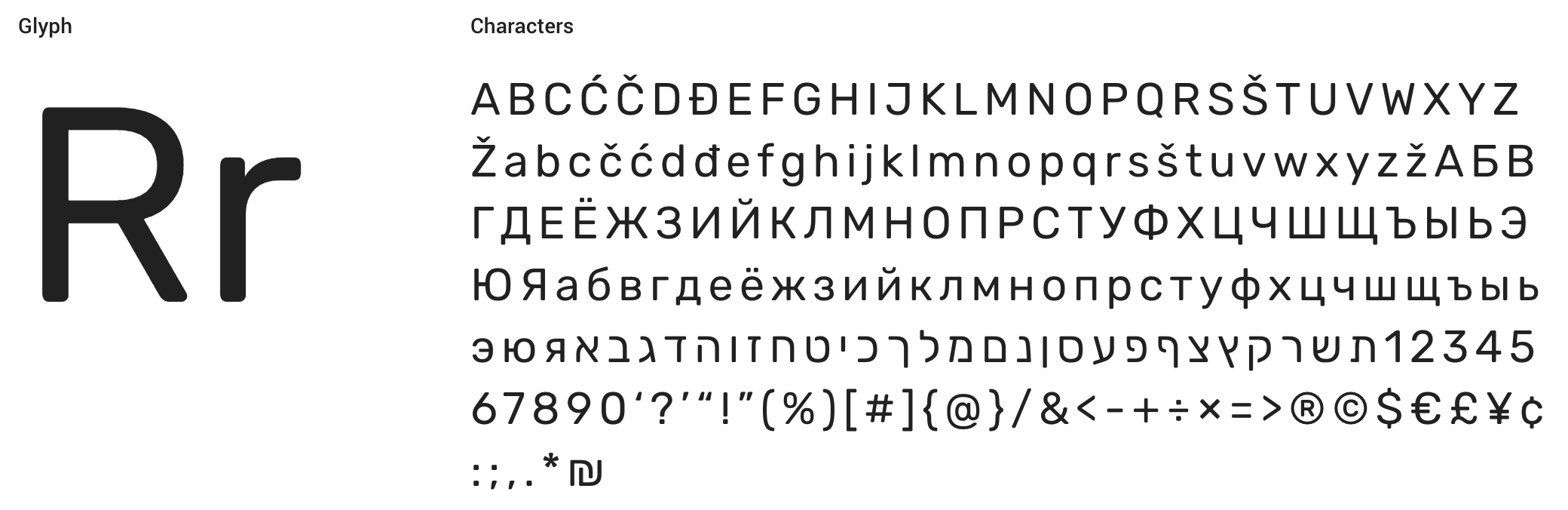
To start we looked at a font that was fun, yet interesting to read. We ruled out serif fonts from the beginning because we didn’t want the site to read like a textbook. Blocky sans-serifs made the text too bold to read and pointy sans-serifs seemed a bit too jarring for the look we were trying to achieve. We decided a thin and rounded sans-serif was the way to go. It would make the site feel friendly, yet professional, and also be subtly modern. We landed on “Rubik”, a Google Web Font.
Color & Visuals
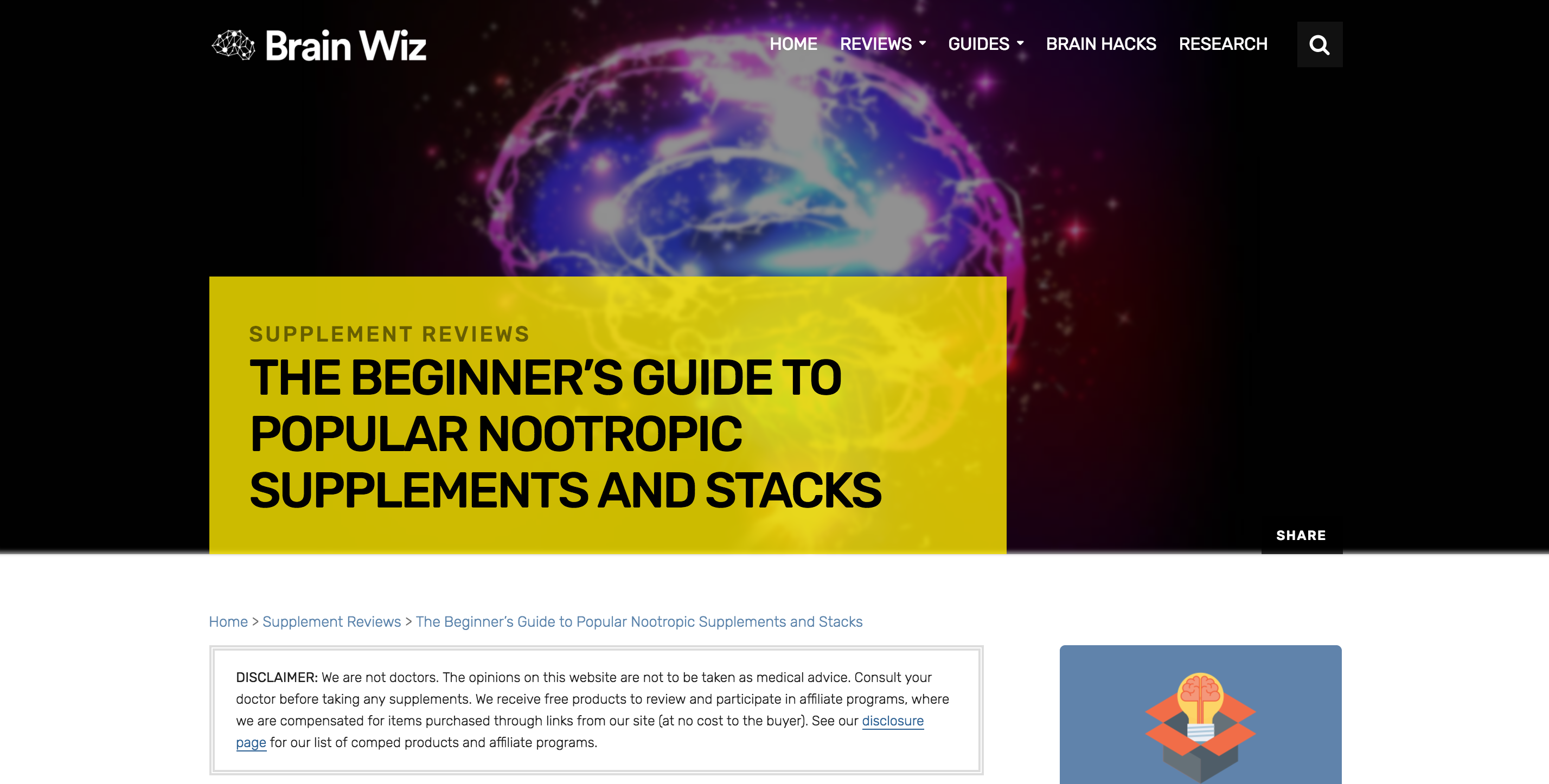
A lot of the websites that Brain Wiz is competing with have similar color schemes — an emphasis on white, with simple accents. This is because many, if not all of them, are simple blogs. We didn’t want to just copy the same color scheme. Our goal was to make Brain Wiz stand out from the pack. Because of this, we went with darker and flatter colors. We also worked with opacity to allow us to overlay the title of all articles on an image.
Functionality
How we interact with the internet is changing. No longer are there just static webpages that we read and move on to the page. As users, we want to interact with the site. Not only does this make the users experience more fun, but they also learn and retain more of the site if they’re enjoying it.
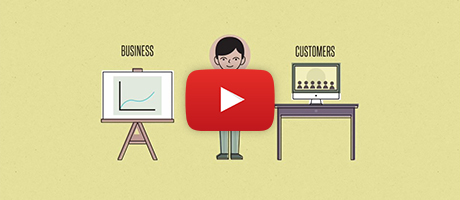
To make the site fun and educational, we added some interesting functionality to it. My personal favorite aspect of the site, in terms of how it functions, is the quiz that we built. During our analysis of the website, we found that the vast majority of the users coming to the website wanted to nootropic to help increase their focus, improve their memory, and give them more energy during the day. However, there are literally hundreds of articles on BrainWiz.org. For more, reading through each and every one to find the best nootropic doesn’t make sense. To solve this issue, we decided to create a quiz that matched the reader with the right nootropic for them. It was a big undertaking but, in the end, it helped add to the overall quality of the website.
Content Revamp
While much of the content on the site was perfect the way it was, we still decided to perform a content revamp. This meant reformatting some text, ensuring proper SEO, and even adding content to some pages. While not necessary for the redesign, it ended up helping the website keep visitors for longer periods of time.
Speed
Statistics show that people will visit a website less often if it is slower than a close competitor by more than 250 milliseconds. That is literally around the amount of time it takes you to blink once. As you can see, speed is incredibly important when it comes to a website. That is why we placed a big emphasis on it when finishing up the site.
Hosting
First and foremost, when you’re looking to make a website fast, you need to start with a reliable web host. There are hundreds out there that promise to be the fastest and the best but many fall very short when it actually comes to performance. Having tried many of these hosts before, we were able to get in touch with the amazing people behind Flywheel. I don’t say this lightly — they have created one the best (if not the best) WordPress hosting companies. Everything from setting up a staging site to backups are a breeze. Not only that, they are the fastest WordPress host you can go with. This is because they built Flywheel on the impressive DigitalOcean servers. To put the “cherry on top” in terms of speed, we added a CDN (content delivery network) to our hosting package to make the site load even faster.
Code & Images
After hosting, to make a website really fast, you have to look at what is on the actual website. We made sure there was no bloat in the code so that didn’t hold it back. The real tricky part was what to do about the images. Since we placed an emphasis on visuals, this meant big images and big images can take time to load. To compress these files, that meant that when they were at full size, they would look slightly pixelated. However, since these images would be behind the title of the post (the main focal point of the page) we could blur the image a bit to mask the pixelation. This added a great subtle depth effect to the website.
Conclusion
While redesigning this site was a lot of work, it was also a lot of fun. The owners were very supportive of all of our changes and helped make the redesign process run as smoothly as possible.
After launching the new site, BrainWiz.org saw a big drop in their bounce rate (more people were clicking around) and early user feedback shows that they find the site to have a better layout that is easier to navigate and read.
Overall, I’d say this was another successful redesign!
