

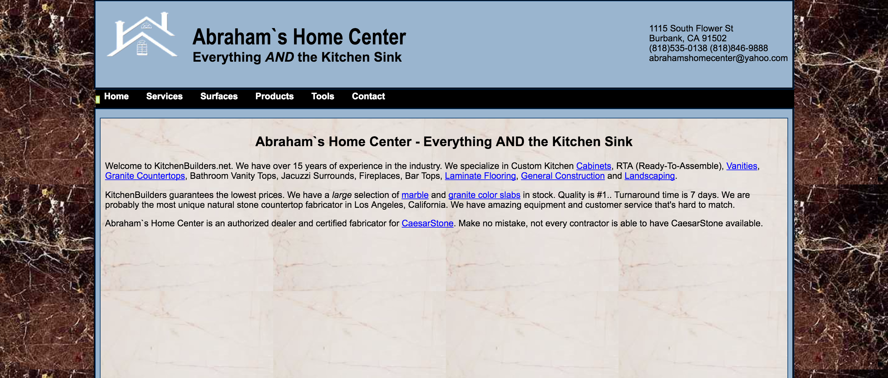
Ryan, the owner of KitchenBuilders.net, came to us wanting to completely redesign their website. It just wasn’t converting as high as he wanted plus he knew it was outdated and unresponsive. After checking out his old site, we completely agreed with him.
What was wrong with the old website?
- Like we mentioned above, it wasn’t responsive (meaning it didn’t resize based on the users browser).
- There were only a handful of pages.
- It wasn’t built on a CMS.
- It wasn’t SEO optimized.
- There was only one form on the entire website (on the contact page).
As you can see, we had our work cut out for us…
Our Plan
After sitting down with Ryan and discussing what he was looking for in a new website, our plan became very clear. His main goal was to convert the people viewing his site to leads. We figured the easiest way to do this (from the users perspective) was through a form on the website. Therefore, our focus going into this project was to make sure that everything we designed on the site would compliment the forms and draw the users eyes to it.
We began the redesign process by creating a color scheme and brand for the new website. Since the old design didn’t have much of a brand, we were starting from scratch. Luckily, KitchenBuilders.net had an old logo and some brochures we were able to draw inspiration from. Beyond using past marketing materials, we actually chatted with a few of the higher ups at the company about their mission and their thoughts on the brand. This helped us narrow things down further.
Once we had our brand guidelines set, we reviewed the content on the old website to see if there was any we could salvage. Unfortunately for us, it was mostly generic and jam-packed with their keywords, a bad SEO strategy called “keyword stuffing“. Keyword stuffing is a surefire way to get penalized by the search engines, so we avoid it at all costs.
Next we took all the information we current had and began working on a mockup design. Within a week we had a mockup and it was approved by our client. The mockup we originally designed ended up looking almost precisely like the final website (except for some small changes).
The final step to the preliminary development process was to create the information architecture for the site. This is the last and most important step. Why? Without the information architecture we are basically creating content blindly. Creating the information architecture gives us a map of what content needs to be created and how it should be optimized for search engines.
After completing all of the initial leg-work to make sure the project would be a success, we began development. Since we had created a “road map” already, it only took three weeks to complete the website.
Conclusion
After concluding the development, making some last minute design changes, testing the site, and finally handing it over to our client, we sat back and analyzed our work. There had been some massive improvements made to the website in terms of conversion optimization and user experience. In fact, only two weeks after completing the site, KitchenBuilders.net is already seeing more conversions!
Check out the new website below…